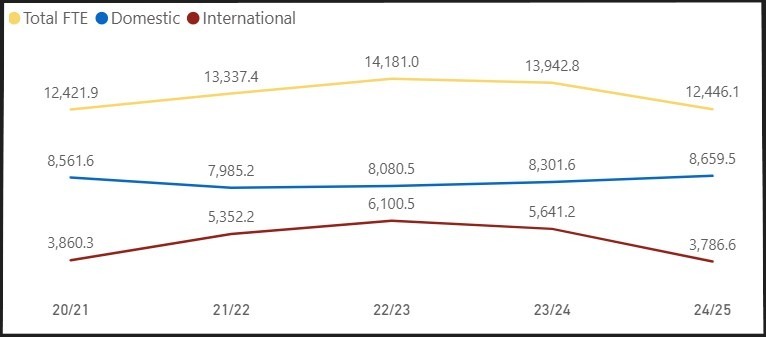
Total FTE, Domestic and International by Academic Year
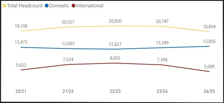
Total Headcount, Domestic and International by Academic Year
FTE - Full-time equivalent (equivalent to number of students taking full course load (not just full-time course load) as of stable enrolment date
Stable Headcount (FTE eligible) - Headcount used for FTE calculations. After the stable enrolment date this includes students who withdrew from the course, as well as students who enroll late.
Domestic/International - Students are classified as International only if they are paying international tuition rates. Exchange students are classified as Domestic students as they pay domestic tuition rates.
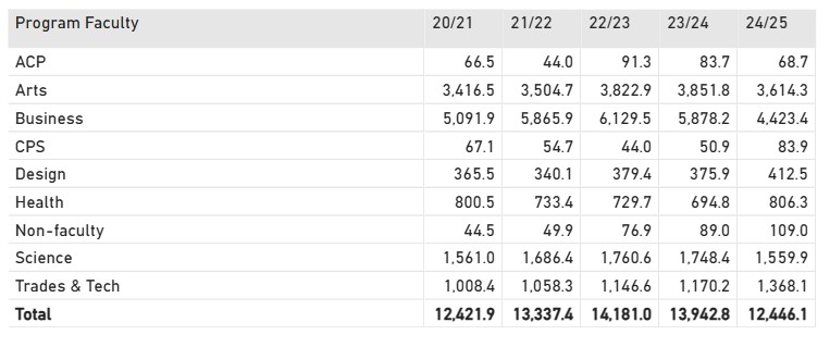
Breakdown by Program Faculty
FTE
Stable Headcounts*
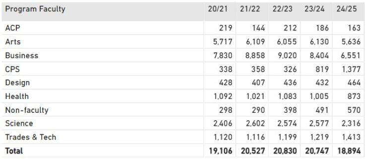
*The Total is a unique count of students and is not equal to the sum of the rows because students are counted in all the program faculties they were in within the academic year.